
Project Overview
The Brief
Design new features on the Netflix mobile app to increase increase social activity on the app
This project is not affiliated with Netflix. The following work is a conceptual educational exercise to practice and refine UX Skills.
The Problem
Design new features on the Netflix mobile app to increase social activity and sharing while maintaining top billing by driving innovation
The Details
UX Team: Tehila Nissanian, Ryan Nightingale, Madeleine Dailey
My Role: User Research, Persona creation, Comparative & Competitive Analysis, Site-mapping, User Flow, Wire framing, High Fidelity Prototype
The Solution
We had several solutions but ultimately we wanted to funnel it down to one new feature which would allow users to share time and recommendations together on the app
Timeline: 3 weeks
Tools: Figma
Platform: Mobile App
Research User Needs & Business Goals
To start off our project my group and I performed a competitive analysis to see what other streaming platforms were doing in terms of how they utilized social networking. We looked at both direct and indirect competitors. We discovered how people interacted within other apps.
We looked at Prime Video’s watch party and we saw that the categorization wasn’t as user friendly because it had a limited selection and wasn't organized well.
Interviews
Our UX team then completed 6 in-depth user interviews with users who use streaming services.
We found users often watching alone but occasionally enjoying social viewing experiences.
They struggle to discover content so they rely on word of mouth recommendations, and compare platforms like Netflix, Amazon Prime Video, and YouTube TV based on content selection.
Sharing recommendations with friends and family is common, with a preference for personal suggestions over algorithmic ones.
Users desire simplified access to content across multiple platforms and personalized recommendations but often struggle with managing their watchlists due to the overwhelming amount of content.
Roadblock
From those interviews we started to create a user needs statement but hit a roadblock because our research objective was too narrow.
We revised the objective and got 1 more person who fit the criteria - To understand how people socialize, watch TV/movies together, and how they use media to share their experiences
Synthesize Research Into Personas & Problem Statements
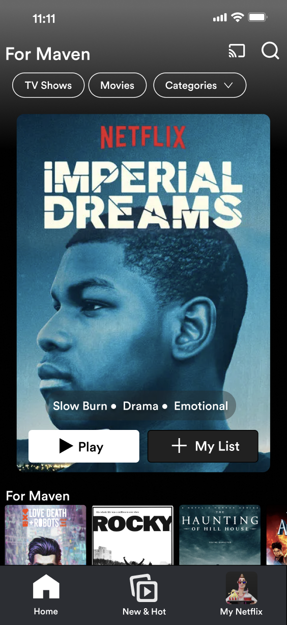
We then took all our data, the old and new, and broke it down to create a persona whom we named Movie Maven.
Maven enjoys the entertainment provided by watching TV and Movies but ultimately values the social connection of sharing the experience with others.
Maven's goals and behaviors are that they frequently use online streaming services, share their favorite shows with friends, and enjoys organizing spontaneous movie nights.
Maven's Challenges show up when trying to find new content to watch, they have a desire to access popular content- stay with the trends, and lastly, Maven has a difficult time organizing gatherings, including scheduling and communication
Ideate Solutions Through Sketches and Build Wireframes
We went to the drawing board to ideate and sketch out a watch party feature and the ability to pin a personalized recommendation from a friend

I then created a site map with all the new features to give it some visualization and navigation

We created a user flow to showcase how the user would interact with the app

Flow 1: Dismiss Notification
This flow shows the user how to dismiss a pinned recommendation that was given by a friend - during our usability test users we unsuccessful in figuring out how to do this so we decided to add an X in the top right corner to give our users multiple different ways to dismiss this notification

Low-Fi

Hi-Fi
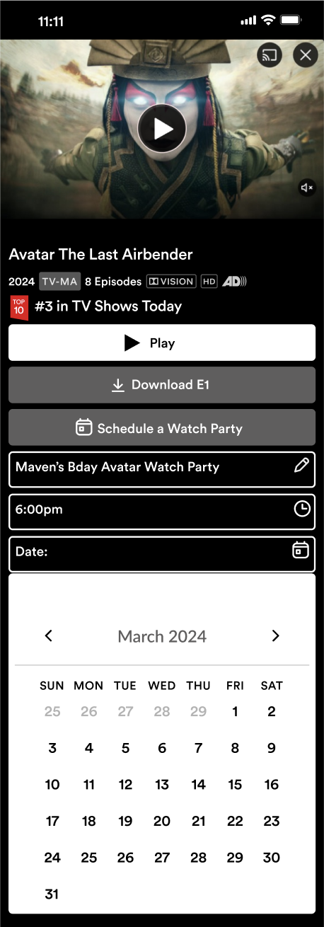
Flow 2: Locate “Watch Party”
This flow shows how the user will Locate “Available for Watch Party” category And schedule a watch party. Our usability test showed that 4 out of 5 users were able to locate the category section.
Low / Hi-Fi

Flow 3: Schedule Watch Party
This flow shows how the user would schedule a watch party. Our usability testing showed that all 5 users were able to fill out the information.
Our feedback from the test wanted a calendar to pop up instead of manually entering the date.
Low Fi

Hi Fi
Flow 4: Share link
Share the link so the user can send out to friends- this was our most successful task and all 5 users were able to complete. During the test, we saw that our click point to navigate to the next page was small so in our Hi-Fi we made a bigger click area so users can navigate seamlessly to the next page.
Low / Hi- Fi


Accessibility Considerations
When we built our mid fi wireframes, our main objective was to really try to recreate Netflix as true as we possibly could and then just implement the new features. But during usability testing, it came to our attention that, particularly with one user who was visually impaired, that they were having a really hard time seeing the footer words and the icons. So in our hi fi reiteration, we made sure to correct for this. Lastly, we also input icons into the text fields for people who are using screen readers.
Original Netflix


Visual Design For Hi-Fi
The final iteration of the Netflix mobile app allows users to easily interact with friends and schedule watch parties.
(For the best viewing experience, expand the below prototype by clicking on the enter full screen icon on the top right.)
Next Steps for Netflix
Conduct a second round of usability testing on the Hi - Fi wireframes. Then based off of the results to then create another set of wireframes
We are looking at expanding on new features like adding a live chat feature to the Watch Party, adding a friend request section for Netflix Network so that you can actually grow your network like you can on other social media apps.